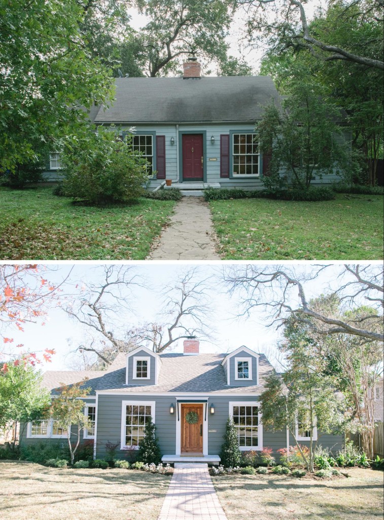
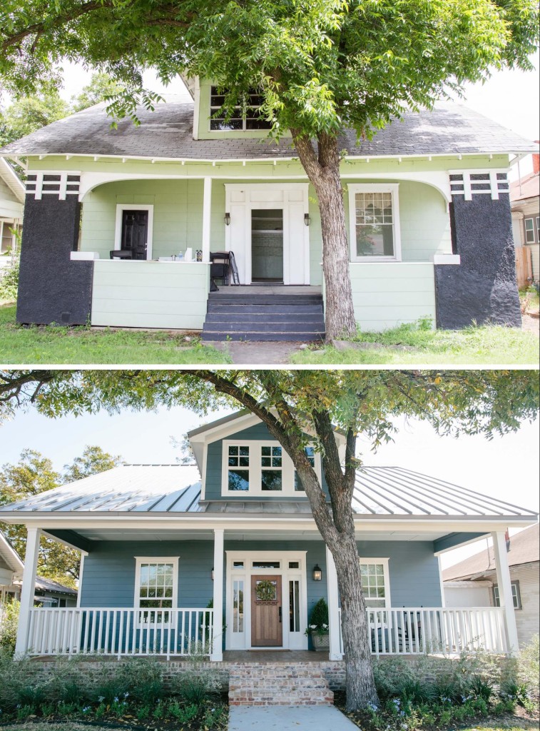
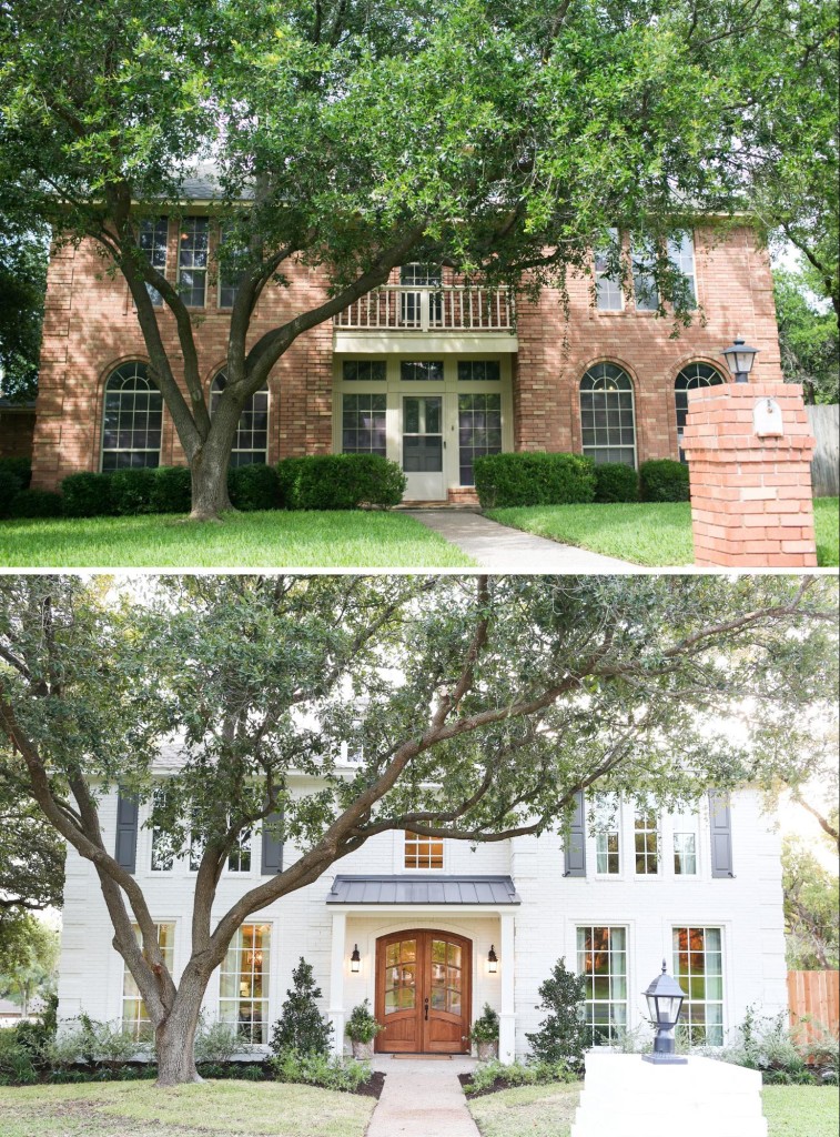
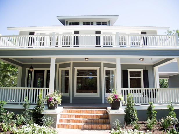
I probably don’t need to say a thing in this post, because well, duh…Fixer Upper, right? But I thought it would be fun to share some curb appeal and landscaping ideas from Fixer Upper.
Do I really need to express my love for them as a couple, their show & all the fabulous business ideas they have together? Let’s just go ahead and say they have built an empire, and as a a big fan of their show, I am so proud for them!
I mean, Joanna’s visions alone are so inspiring. And what they BOTH do to the fixer upper homes is so impressive! They only thing I hate, is that the “after” shots are too short on their show! I want to take in all of it on a much slower basis. I love watching the process, don’t get me wrong, but I also want to see every detail inside & outside. While eating some chips & dip, of course.
I especially want to see all the curb appeal and landscaping ideas from Fixer Upper geniuses’ Chip & Jo. They don’t show that part enough or close up, in my humble opinion.
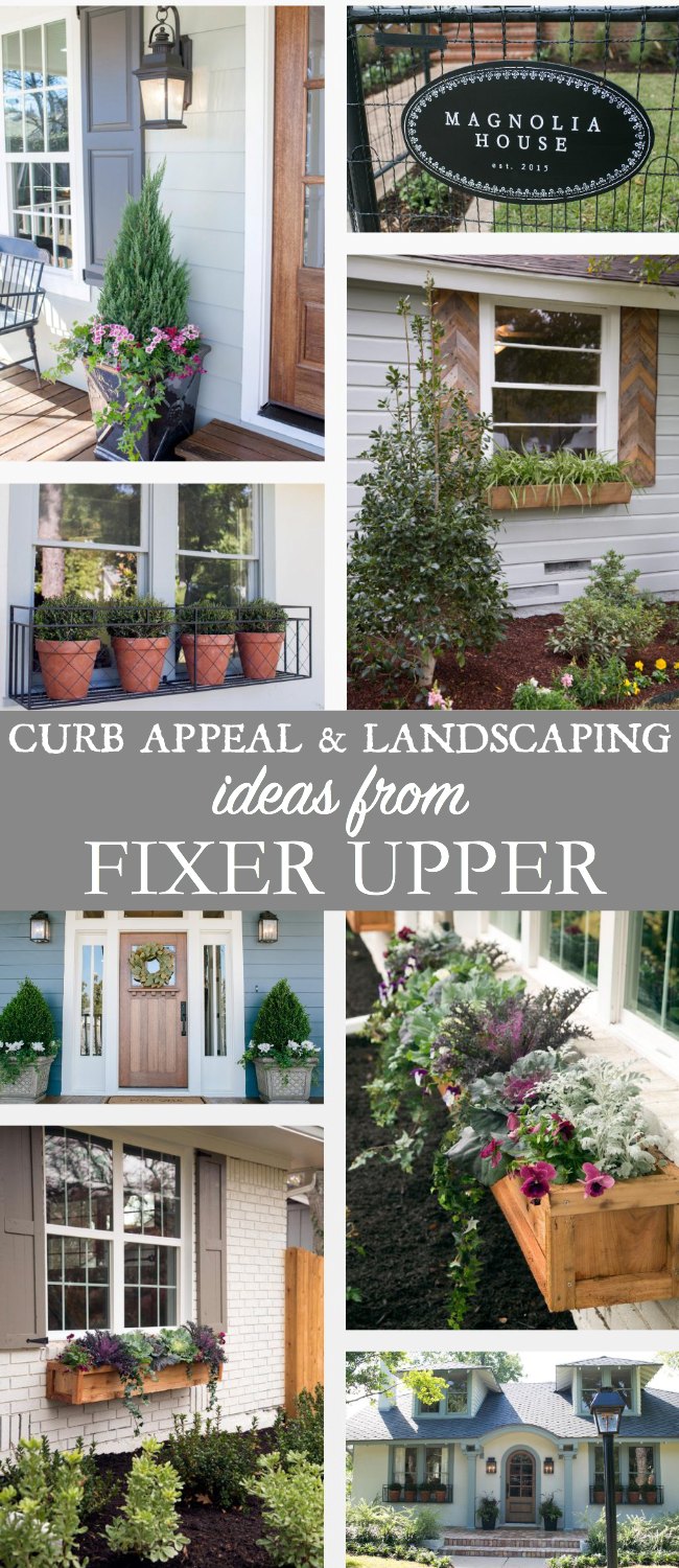
Most of us need a lot of help in this area alone for tips & inspirations. Or at least I do. Landscaping can be so expensive, but I also love the symmetrical look they achieve when designing the exterior of their homes.
She of course, designs the accessories of the exterior to flow along with the home, but the actual landscaping visions I believe comes from both of them.
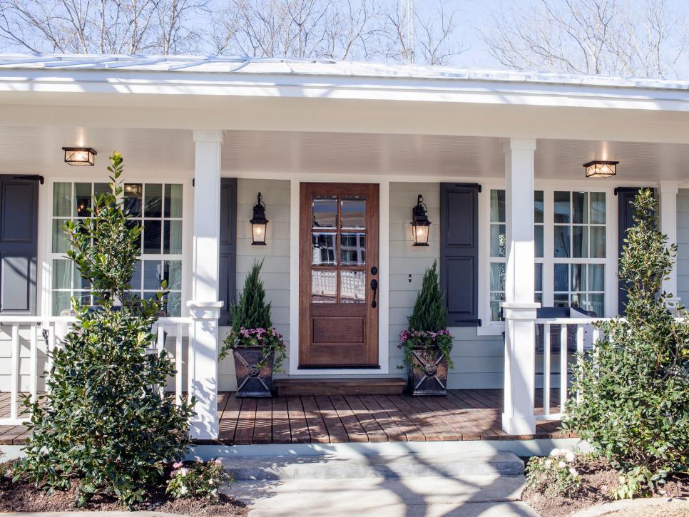
I’ve also noticed that the majority of the time (not all) she uses pops of color in her flower containers or urns that flank each side of the door. They do use color in the yard and general landscaping of the homes, but you don’t see a whole lot of color. Obviously, she’s going for a quick finish but I feel she is being very considerate to the overall design and layout of both the exterior and the interior.
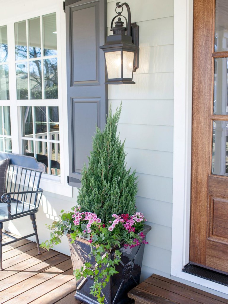
Carriage House Flower Container Idea
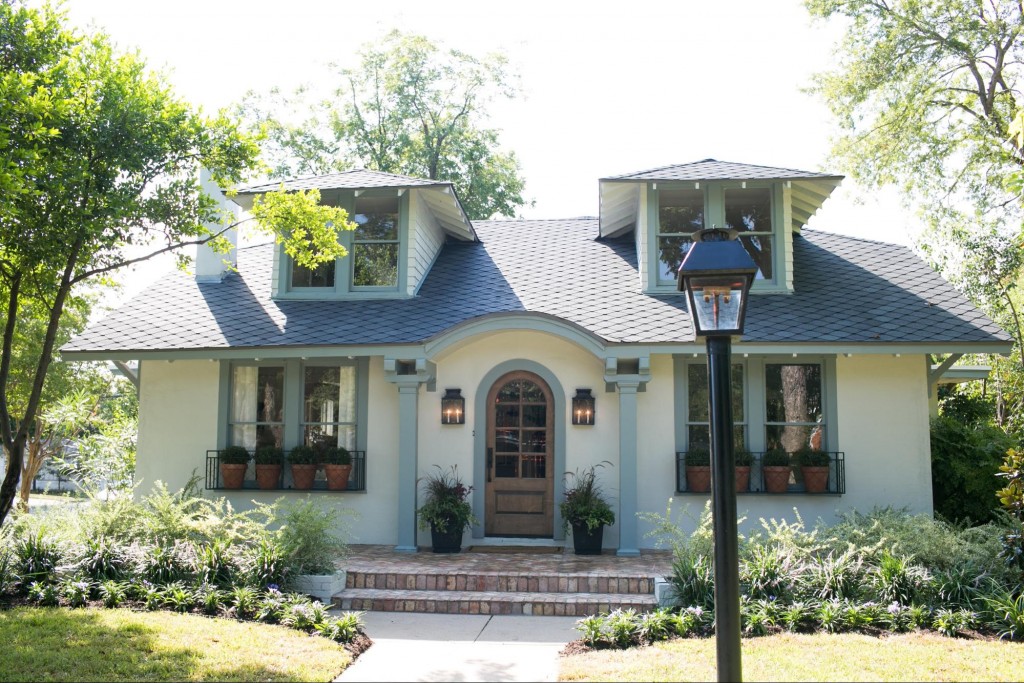
They gradually curve the landscaping so it can be easily mowed, and they use mostly green shrubs, ferns, and for a lack of a better word – spike-y plants for layering and height.
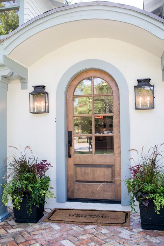
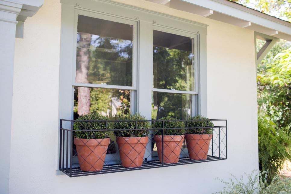
Their window boxes vary but as a whole they use pops of color to make the windows shine as an architectural feature. I also read in one article that she likes to use cabbage in her boxes, and I do think that varies as well based on the season of the remodel.
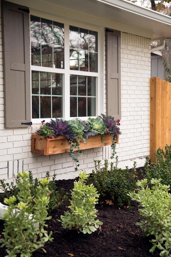
I love the landscaping of the Tire Swing House, and how the different colors of green in the shrubs match the textures and greens in the window boxes. Plus, her use of color for this particular home (purple or plum) is consistent throughout this remodel’s exterior.
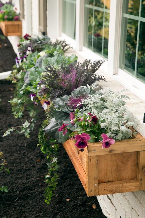
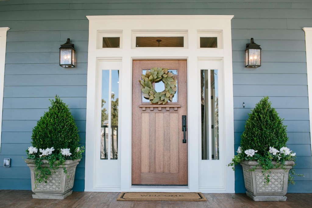
The 3 Little Pigs’ House is an example of how they only used white as a pop of color to allow the color of the exterior to shine. You can never go wrong with white, it is so classic! All of the other landscaping that was added was all green shrubs or bushes.
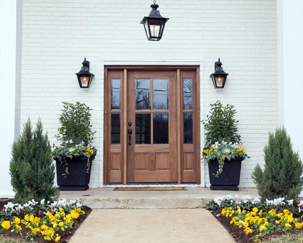
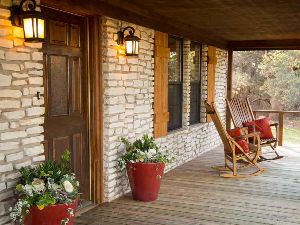
You can see, they invest a lot of money into the flower planters & the flowers themselves that sit beside the doors and almost all of their Fixer Uppers. The flower planters truly frame the exterior entry way of any home. Your yard can look a little shabby, but if you have pops of color and big statement pieces on each side of your door, one’s eye will automatically go to those flower container statement pieces.
So, invest in those flower containers & the flowers themselves!!! Make sure you plant flowers that are going to last, and give pops of color for at least 2 seasons!
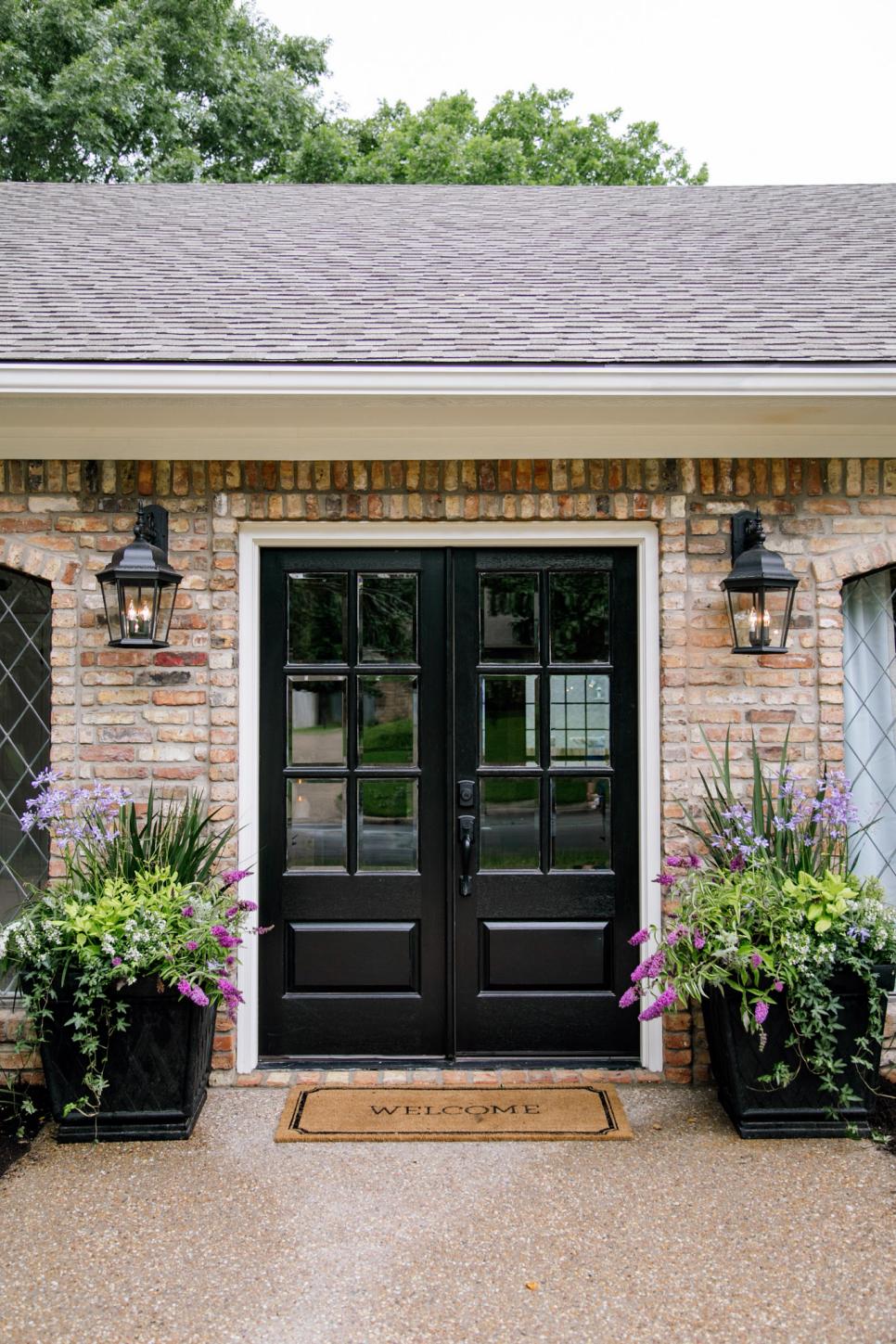
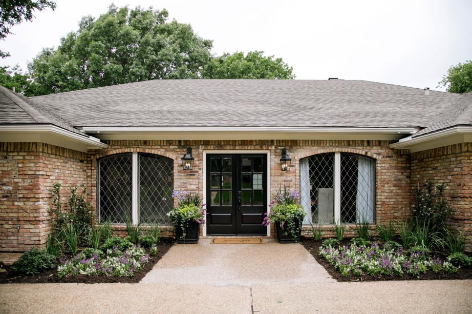
The above is another great example of using just a few colors throughout the yard and her flowers planters. Shades of purple, white and of course various shades of green as well.
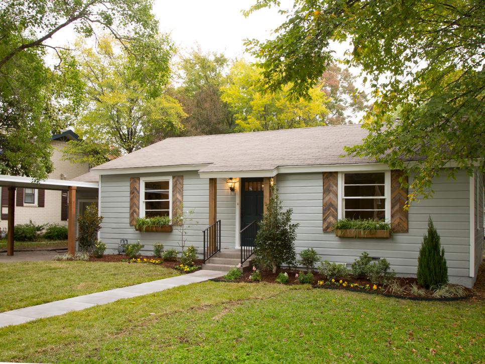
Front Yard Curb Appeal with custom shutters and window boxes
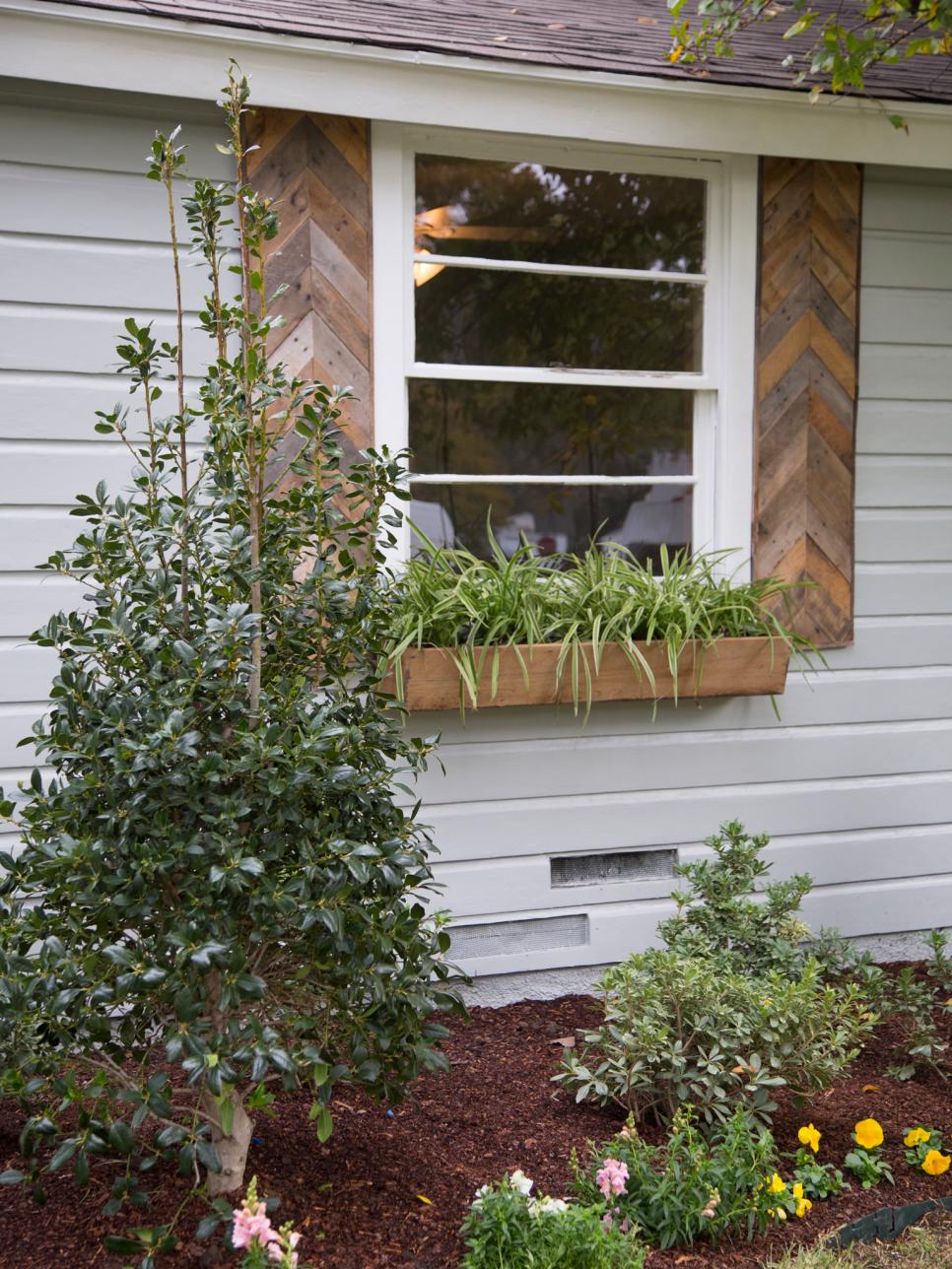
Chevron Shutters + Window Boxes
Twin Flower Container Gardens + Landscaping
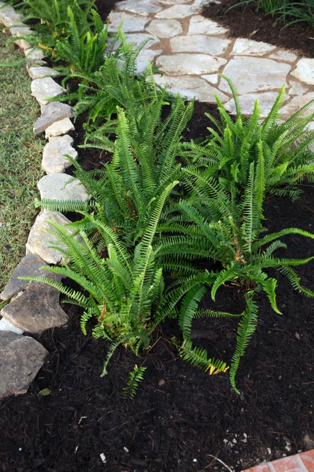
A fresh landscape idea to add ferns and fresh mulch
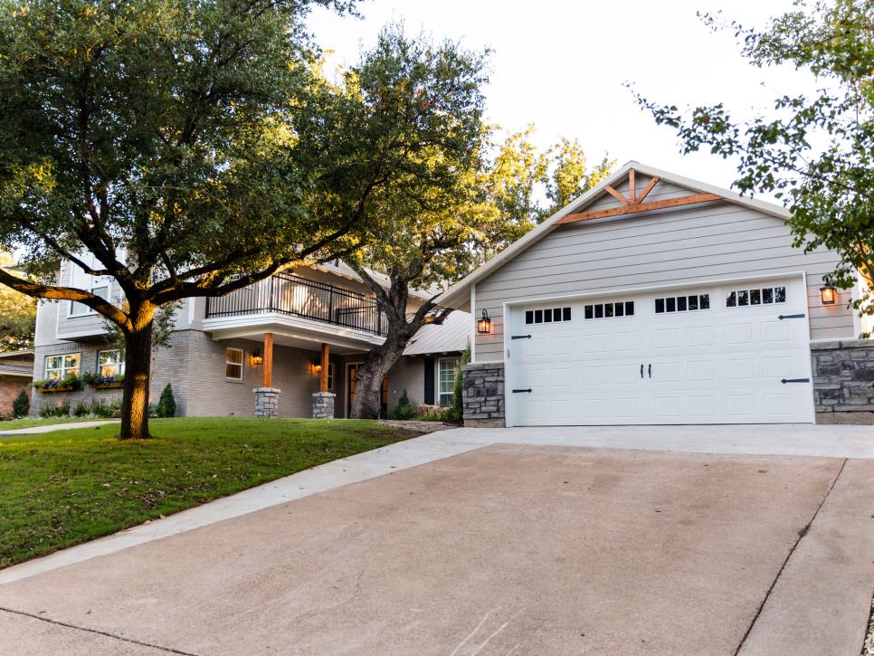
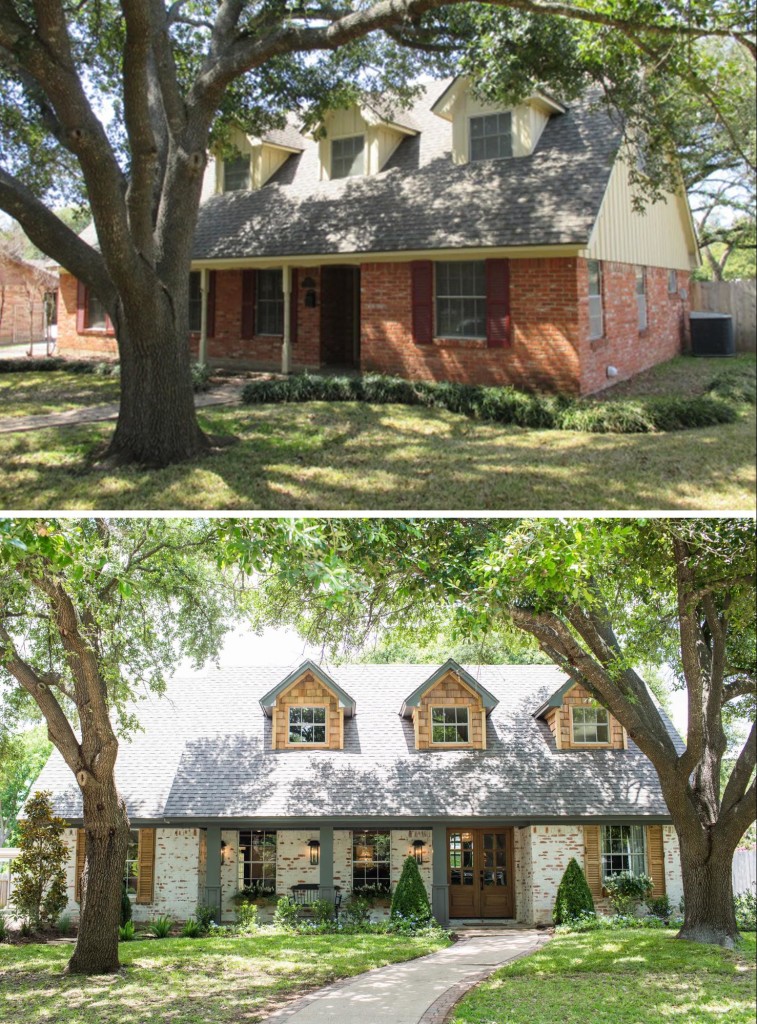
Don’t forget the garage and lawn
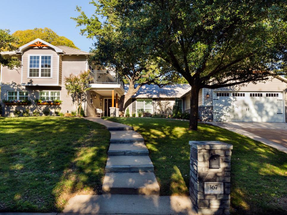
Lots of landscaping ideas for the front yard
This house below was one of the most amazing transformations. Well, they all are, but they did an incredible job on this house. It’s obviously Winter for this reveal but they once again capitalized on what was in season & stuck to a white & green theme. Which truly worked for this home!
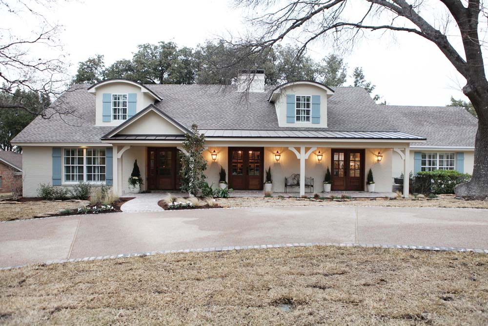
I really like the Nut House’s curb appeal as well. The various heights of green shrubs, textures of monkey grass, and of course the pops of color that her flower planters provide. It all works so well together.
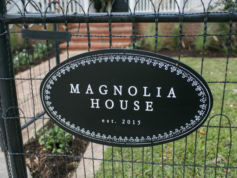
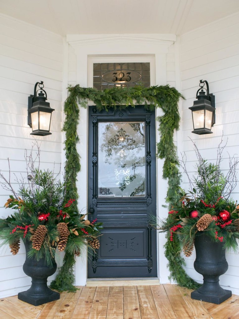
And then there’s the Magnolia House! I love the little sign they added, and how she decorated the entry way for Christmas. That was so fun to see! Obviously she used some Christmas decor into the planters, but she also added sticks, pinecones and of course various shades of greenery. It all works beautifully together.
Some of the other tips I’ve learned from their show:
*They purchase some large statement pieces for their landscaping and reveal of the show, but a lot of the things are smaller. Which helps tremendously with the cost.
*They leave ample room for growth, in between the shrubs.
*Mulch, Mulch, Mulch
*They trim trees back that cover or hide the homes.
*Window boxes are treated like an actual architecture piece to the home.
*Pavers and a distinct designed pathway to your front door is a huge element of the design of your home.
*Lastly, making a bold statement with your exterior lighting is everything when it comes to curb appeal!
Hope you enjoyed seeing some of the curb appeal and landscaping ideas from Fixer Upper! I know any chance I get to see photos of some of their designs (inside & outside) I’ll gladly take to gain some great inspiration for my own home.
